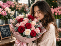
Який букет виглядає дорого. Деталі, які формують преміальне враження
Дорогий букет — це не завжди про ціну. Це про відчуття стилю, гармонії та уваги до деталей, які разом створюють ефект «вау».
Візуальне сприйняття: що робить букет преміальним
Перше враження формується за секунди, і саме зовнішній вигляд букета визначає, чи виглядає він дорого.
- Гармонія кольорів
Дорогі букети завжди мають продуману кольорову палітру. Найчастіше це:
— монохромні композиції (наприклад, повністю білі або ніжно-рожеві)
— глибокі благородні відтінки (бордовий, кремовий, пудровий)
Яскраві, контрастні поєднання можуть виглядати ефектно, але не завжди створюють відчуття преміуму. Стриманість і баланс — ключ до «дорогого» вигляду.
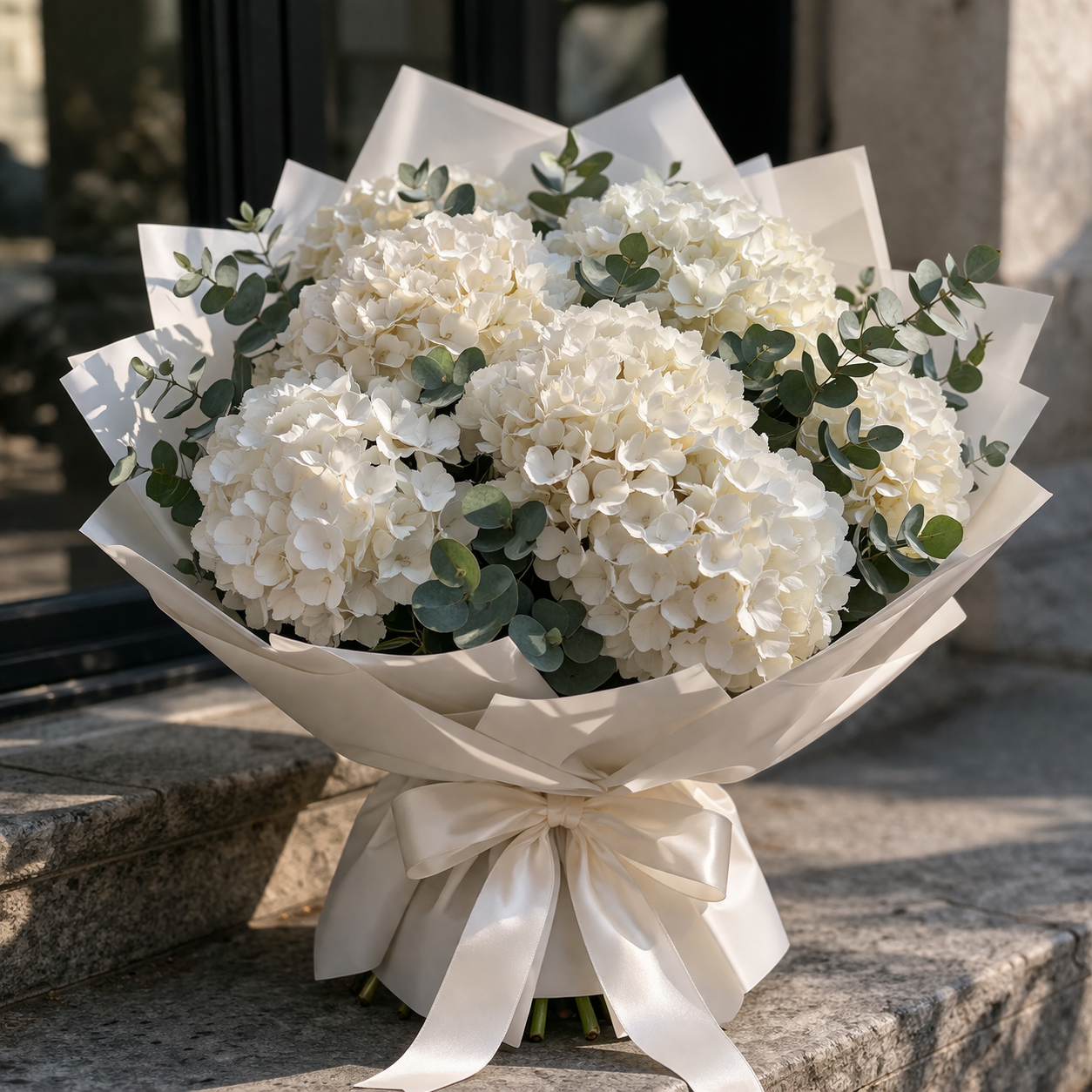
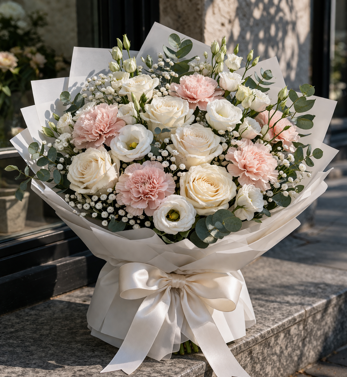
- Об’єм і форма
Великий, щільний букет завжди виглядає дорожче, ніж розріджена композиція. Ідеальна форма — округла, симетрична, без провалів.
Такий букет виглядає цілісно і дорого навіть здалеку.
- Якість самих квітів
Преміальний вигляд дають не просто квіти, а конкретні сорти:
- піоновидні троянди
- гортензії
- еустоми
- ранункулюси
Вони мають багатошарову текстуру та виглядають «глибше», ніж класичні дешеві сорти.
Деталі, які підсилюють ефект «дорогого букета»
 Саме нюанси часто вирішують, чи буде букет виглядати стильно або звичайно.
- Упаковка і подача
Дорогий букет ніколи не має дешевої або перевантаженої упаковки.
Найкращі варіанти:
- матовий папір
- мінімалістичні відтінки (білий, беж, чорний, пудровий)
- акуратна стрічка без зайвого декору
Чим простіше — тим дорожче виглядає.
- Свіжість і доглянутість
Навіть найдорожчі квіти втратять ефект, якщо вони не свіжі.
Пелюстки мають бути:
- щільні
- без пошкоджень
- без темних країв
Свіжий букет виглядає «живим» і одразу сприймається як якісний.
- Робота флориста
Професійна збірка — це те, що відрізняє дорогий букет від звичайного.
У хорошому букеті:
- всі квіти розташовані рівномірно
- немає хаосу
- композиція виглядає збалансовано
Це створює відчуття продуманості і високого рівня.
Дорогий букет — це поєднання правильно підібраних квітів, гармонійної кольорової гами, об’єму та уваги до деталей. Це не про кількість декору чи складність, а про баланс, стиль і якість виконання.
Саме такі букети справляють сильне враження, виглядають статусно і запам’ятовуються надовго.